North sydney council
User Experience Case Study
Overview
North Sydney Council’s website was outdated, difficult to navigate and made it hard for residents to find essential information. As a result, the council’s help desk was overwhelmed with calls from people who could not easily access information online.
The before
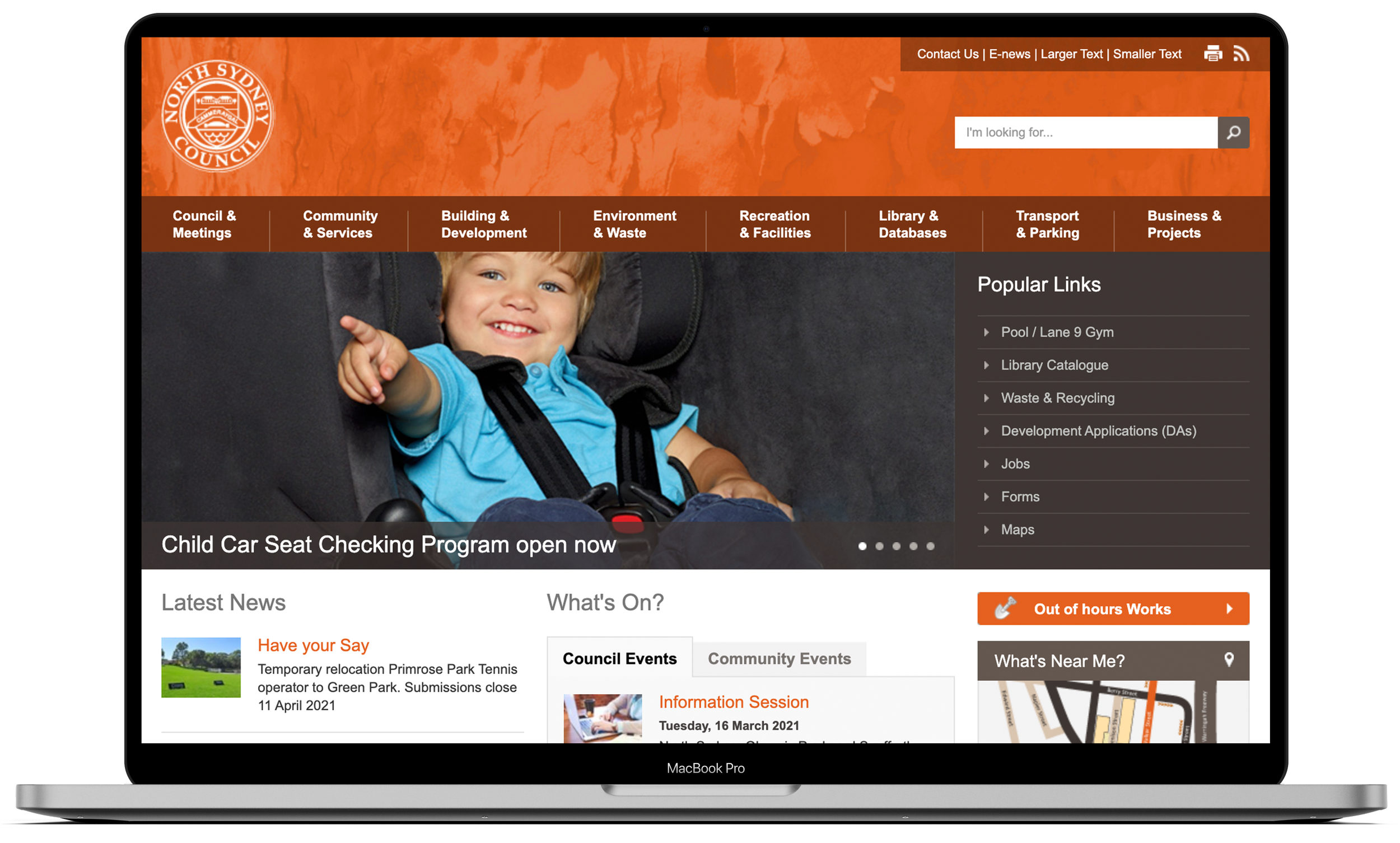
Key issues
Information was difficult to find
Even for common tasks such as checking garbage pickup times, finding local events or viewing upcoming council meetings.
Confusing and inconsistent navigation
Users often had to click through multiple pages, encounter repeated content or land on the same information in different places. This site was bloated, slow and frustrating to use.
Inconsistent visual design and branding
Fonts, buttons, link styles and page layouts varied across the site, weakening the council’s credibility and making the experience feel disjointed.
Poor accessibility and mobile usability
The site was difficult to use on mobile devices and did not meet modern accessibility standards.
The process

Implemented improvements
Improved website search functionality, allowing users to quickly locate the information they needed.
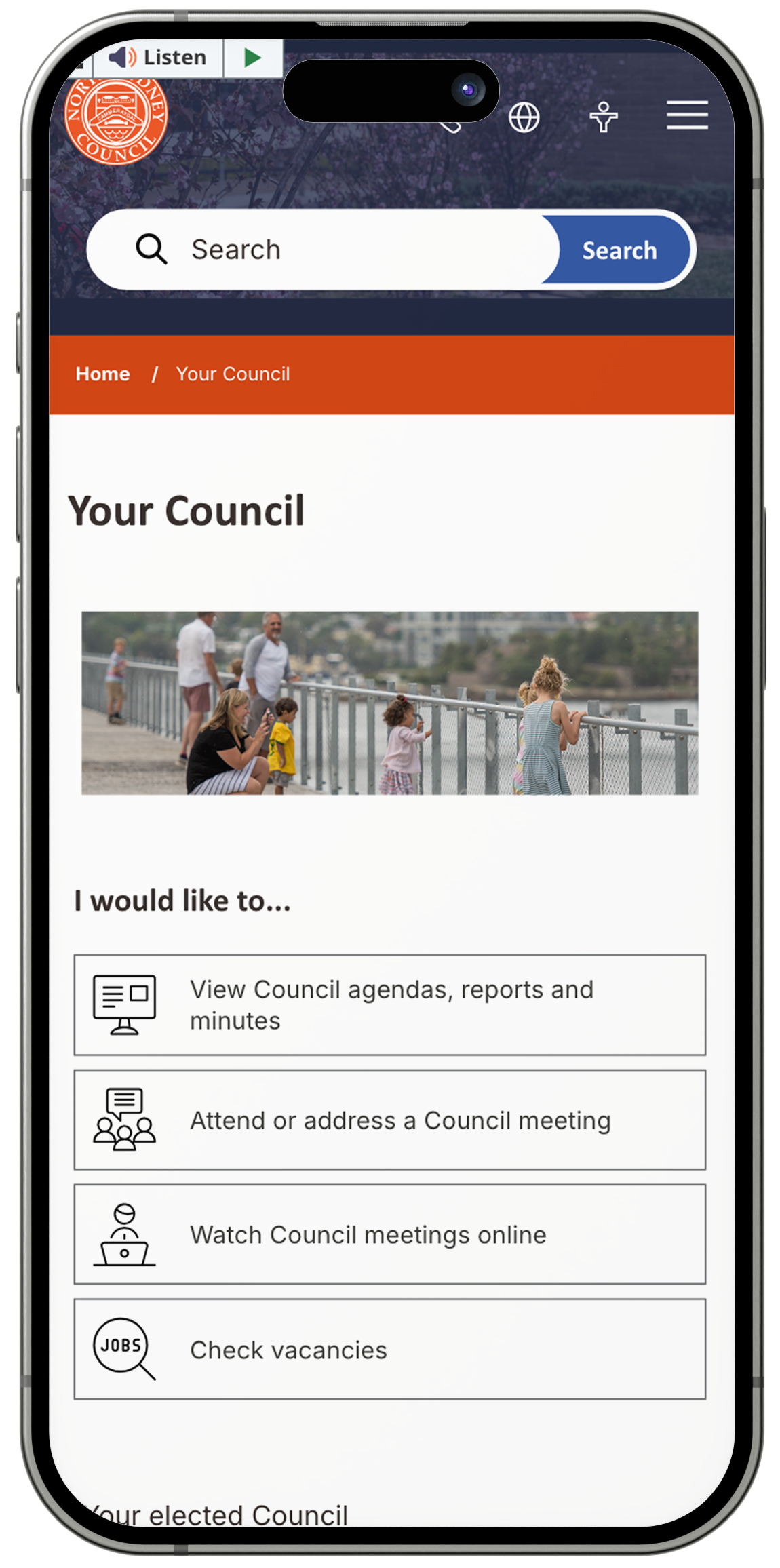
Prioritized key information on the homepage by adding clear calls-to-action based on data about the most common user needs.
Restructured the website navigation and page hierarchy, reducing unnecessary pages and rewriting content to be clearer and easier to scan for digital audiences.
Implemented a digital style guide to create consistency in typography, buttons, layout, and voice across the entire site.
Redesigned the site with accessibility and responsive design in mind, ensuring it works well across devices and meets accessibility standards.
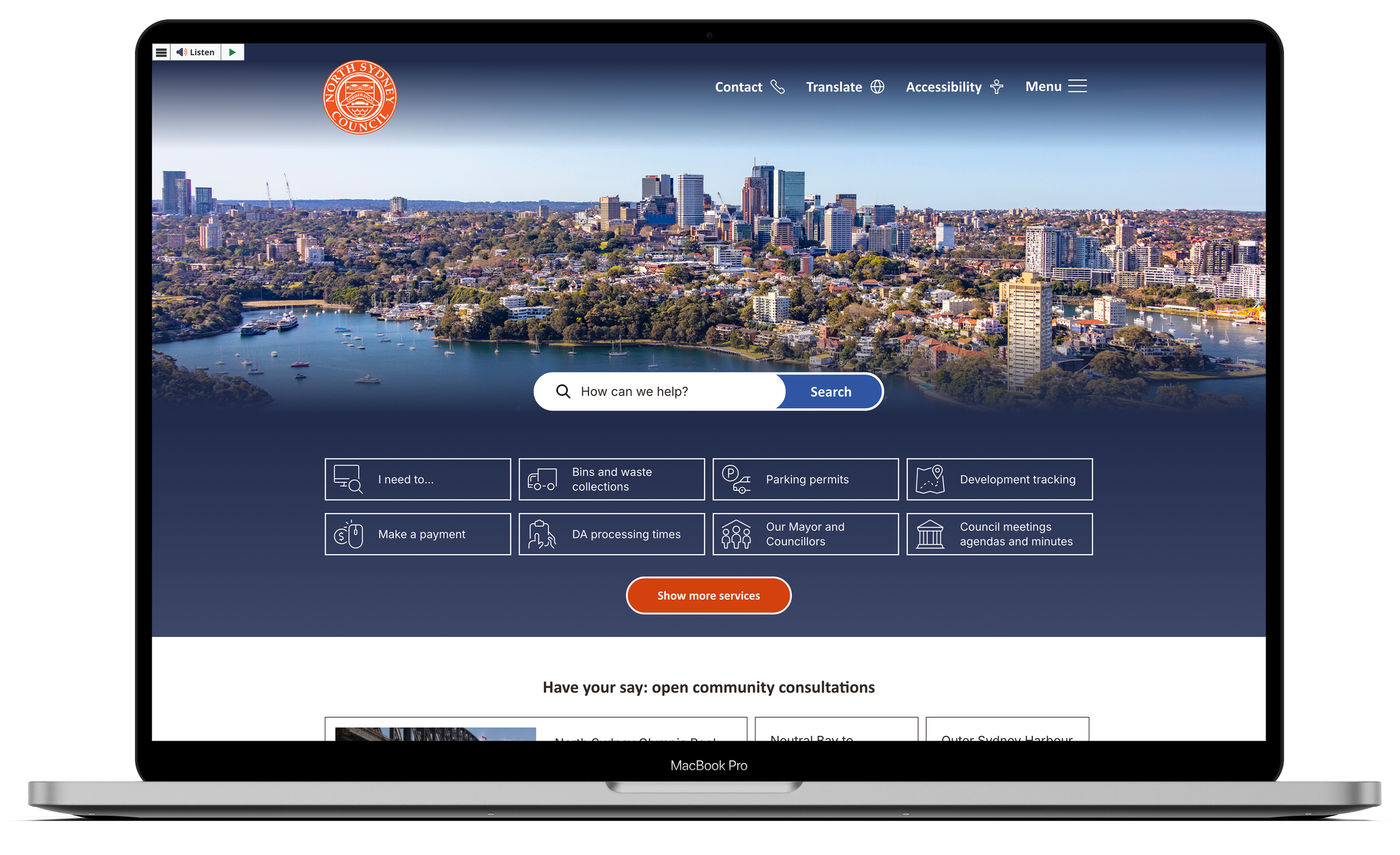
The after
Impact and results
Significant reduction in help desk calls as residents were able to find information independently.
The website received a Local Government Award for Most Accessible Government Website in Australia.
Improved mobile usability through a cleaner, responsive layout.
40% faster time-to-information, allowing users to find what they needed more efficiently.
Lower bounce rate, indicating improved engagement and navigation clarity.